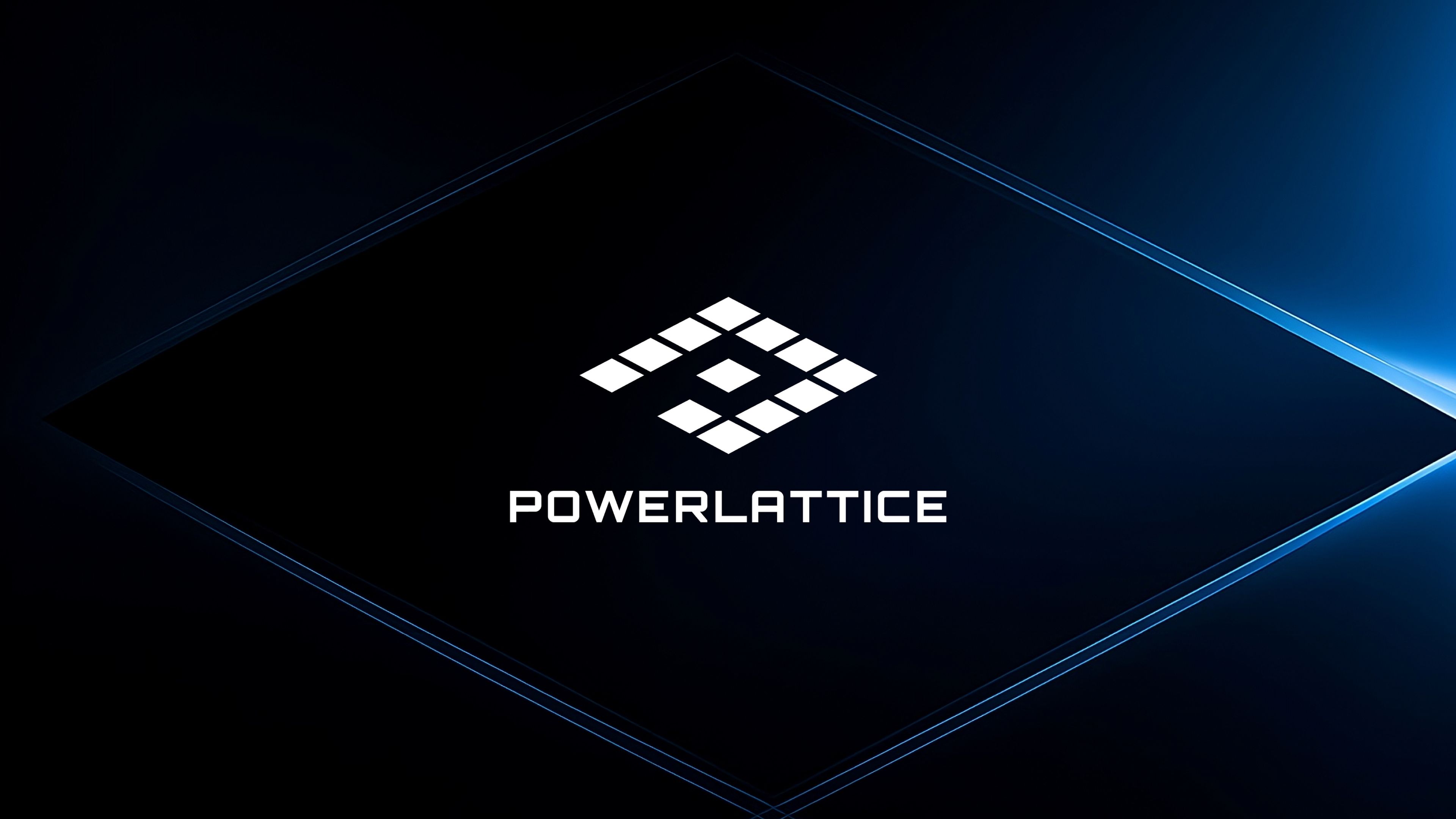
PowerLattice is reimagining power delivery for next-generation AI accelerators with the industry's first power delivery chiplet
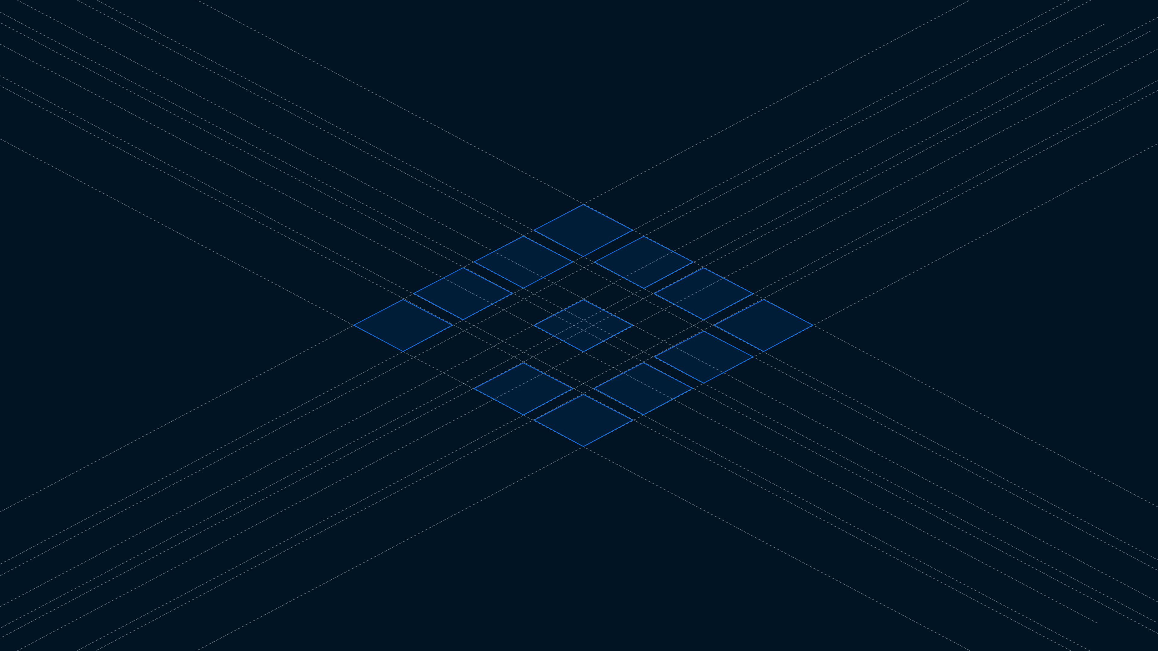
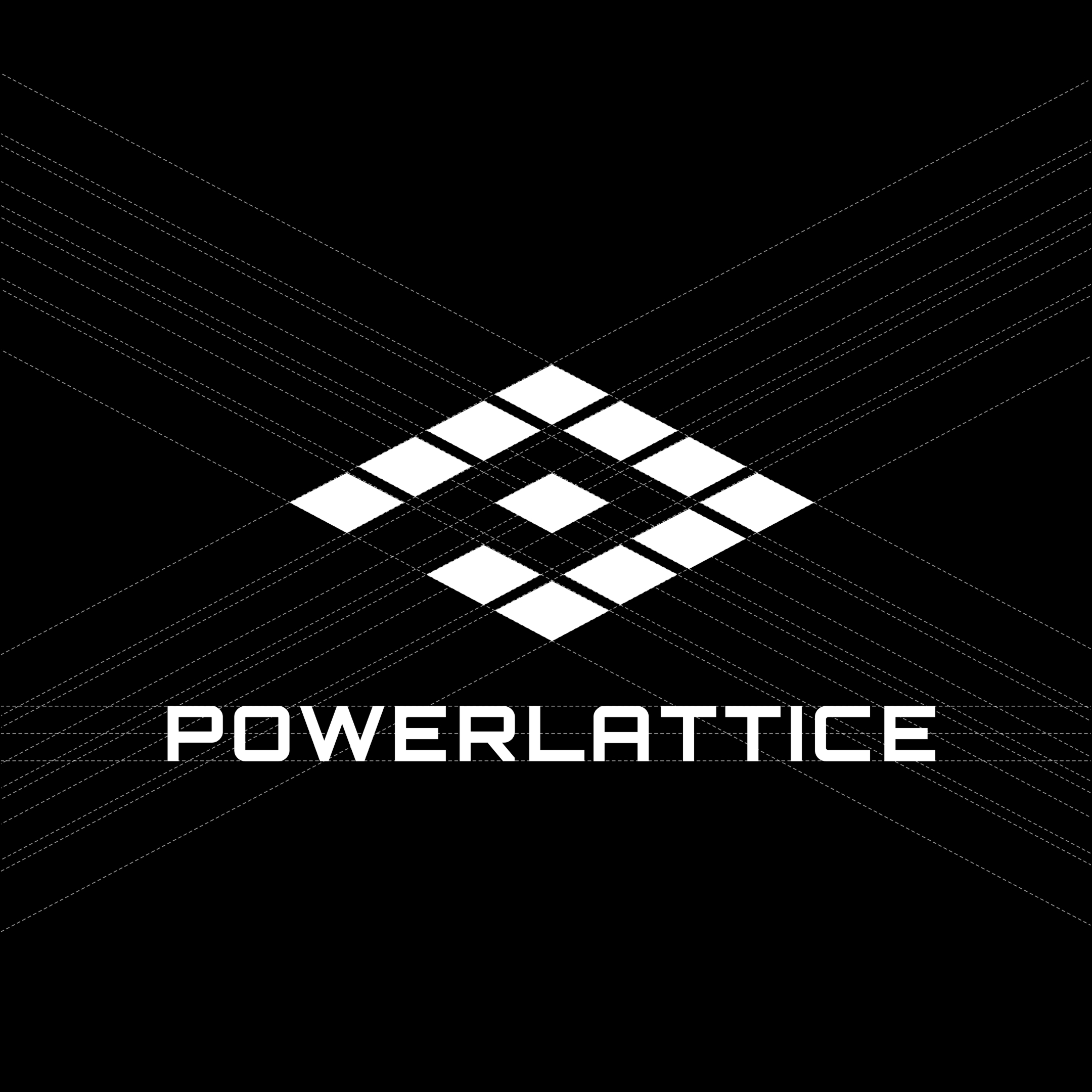
The PowerLattice identity was designed as a direct abstraction of the company’s core technology: a power delivery chiplet architecture engineered at the silicon level. The mark draws from the visual language of microprocessors and circuit pathways, while subtly forming a “P” that encodes both power and precision into a single geometric system. The result feels less like a traditional logo and more like a foundational piece of infrastructure — engineered, scalable, and deeply technical.
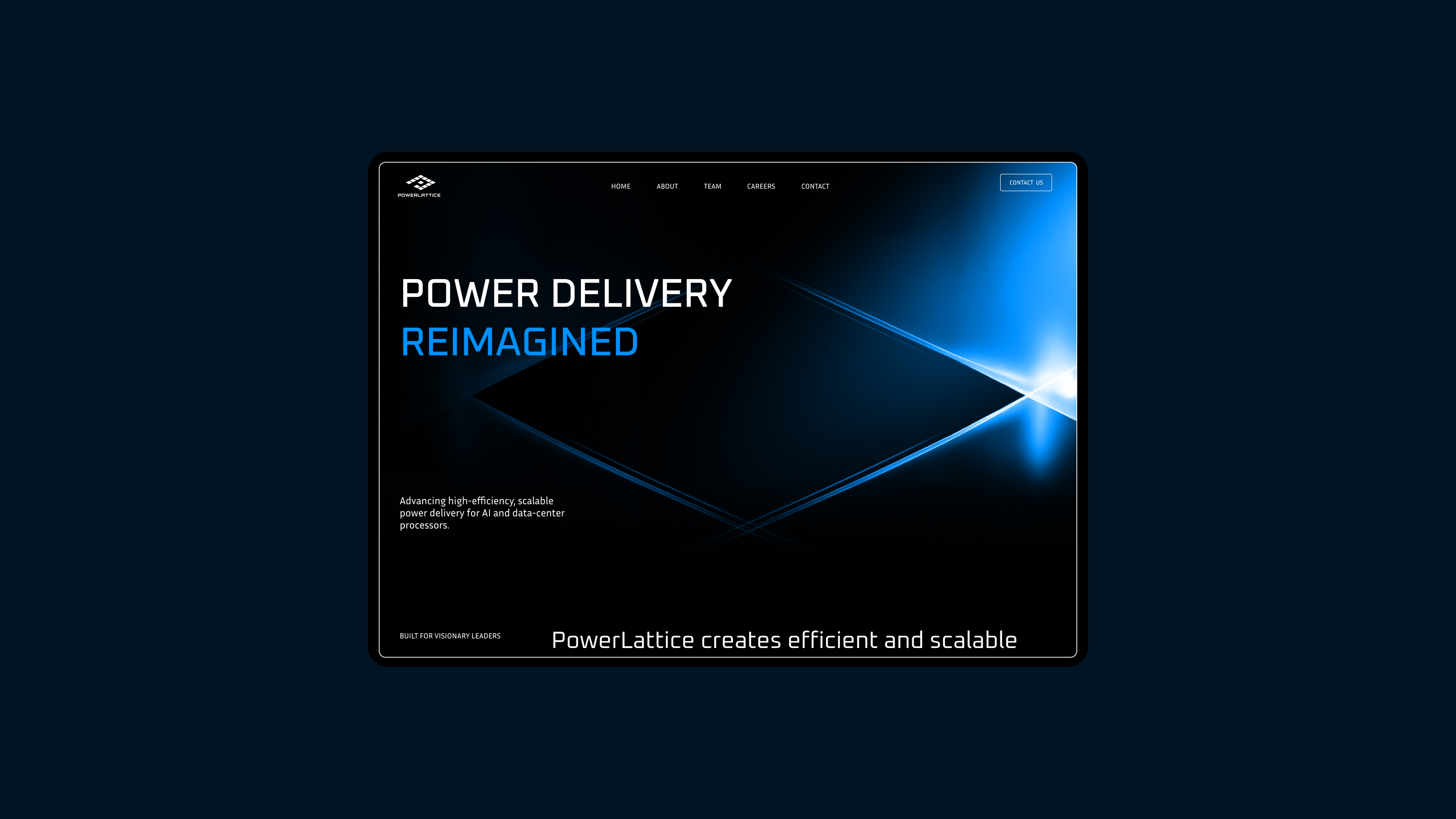
The PowerLattice website was designed to feel like an extension of the technology itself: precise, engineered, and performance-driven. The experience uses restrained motion, luminous gradients, and structured spatial systems inspired by semiconductor architecture to guide users through highly technical information with clarity and momentum. Every interaction and layout decision was built to balance deep technical credibility with a modern, investor- and enterprise-ready experience.
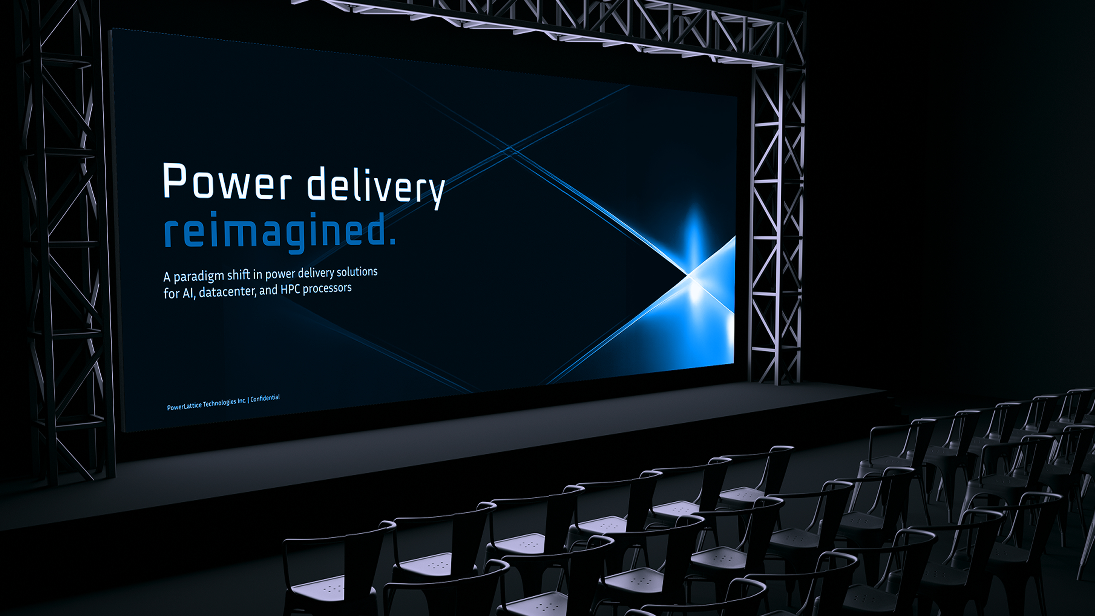
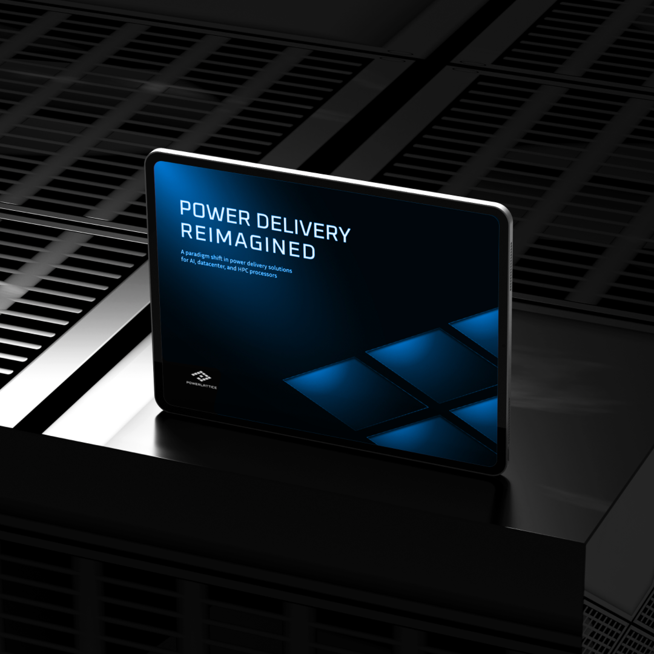
The visual system for PowerLattice was built around the idea of computational energy at microscopic scale — drawing inspiration from chip surfaces, conductive pathways, and light behavior inside advanced hardware systems. Macro layouts are paired with ultra-close technical textures and component-inspired details to create a sense of depth, cohesion, and engineered precision throughout the experience. The result is a design language that feels simultaneously cinematic and scientific: minimal in composition, but dense with intentional detail.
more Work


Design That Moves Frontier Tech Forward
Partner with the design studio trusted by the world’s leading deep-tech founders and investors.







I’ve been working with Sai and team since the early days of True Anomaly and I’m glad to say Warpcraft is our de-facto brand design studio for our entire portfolio.
WILL COFFIELD, RIOT VENTURES

Warpcraft understands defense tech, they can speak the language, and they can turn it into visual information that resonates with defense customers and investors
JOEL ANDERSON, CEO, ZEROMARK

Warpcraft is a much needed design partner for frontier tech, which is why we work with them for some of the most important companies in the portfolio.
JONATHAN LACOSTE, GENERAL PARTNER, SPACEVC

The Warpcraft team were my design partner from day one, before we even had a name, and helped us work through not just the visual language of our product and brand, but even the naming and narrative.
DAVID TEARSE, CEO,
KARMAN INDUSTRIES

This team is our go-to design team for both Playground's needs as well as our portfolio's. They've consistently turned complex concepts from quantum computing to engineered-biology, into clear visual communications.
HADLEY WILKINS, PLAYGROUND CAPITAL
I’ve been working with Sai and team since the early days of True Anomaly and I’m glad to say Warpcraft is our de-facto brand design studio for our entire portfolio.
WILL COFFIELD, RIOT VENTURES
Warpcraft understands defense tech, they can speak the language, and they can turn it into visual information that resonates with defense customers and investors
JOEL ANDERSON, CEO, ZEROMARK
Warpcraft is a much needed design partner for frontier tech, which is why we work with them for some of the most important companies in the portfolio.
JONATHAN LACOSTE, GENERAL PARTNER, SPACEVC
The Warpcraft team were my design partner from day one, before we even had a name, and helped us work through not just the visual language of our product and brand, but even the naming and narrative.
DAVID TEARSE, CEO,
KARMAN INDUSTRIES
This team is our go-to design team for both Playground's needs as well as our portfolio's. They've consistently turned complex concepts from quantum computing to engineered-biology, into clear visual communications.
HADLEY WILKINS, PLAYGROUND CAPITAL